
Analyse de données
Rédaction de recommandations
Wireframe et prototypage
Maintenance de Design System
Context

Éditeur de logiciel, Ollam Technologies développe une suite dédiée aux amateurs de jeu de rôle. Pour son lancement, l’entreprise s’est concentrée sur deux logiciels : Lore et Tome. Tandis que Lore est axé sur la création d’univers, Tome s’oriente sur la conception d’histoires.
J’ai rejoint le projet une semaine avant la beta release des logiciels, une phase propice aux retours utilisateurs. Cette période a non seulement permis de tester les fonctionnalités développées pour les deux logiciels mais également l’ergonomie des outils proposés. Une première évaluation a remonté plusieurs frustrations au niveau de l’outil d’édition : la “palette”. Nous avons donc travailler sur une version améliorée on it..
The goals
According to the beta-tester feedbacks on Discord, we listed the following issues :
- Une présence de doublons superflus complexifiant les chemins utilisateurs,
- Une mise en page multipliant le nombre de clics nécessaires pour une seule action,
- Un manque de précision sur les boutons.
The results
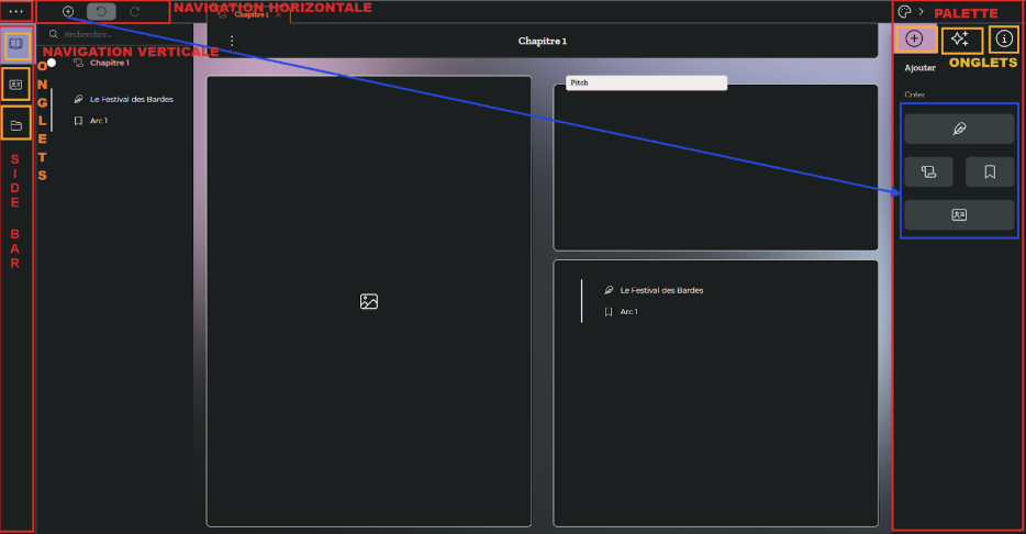
The palette - pictured by the “⊕” icon - was both accessible from the left and right side of the screen (see blue zones). At first, this decision was aiming to adapt to different user preferences. However this created more confusion.
Therefore, we have decided to only keep one palette.In order to maintain balance on the work zone and not overwhelm the left part of the scree - that was already hosting different software functionnalities) - we choose to keep the emplacement on the right. The second advantage to this option was based on the available space for new buttons to come with the growth of new functionnalities.
After this, we could focus exculsively on what the palette will have to offer to the user and how it should be best layed out.
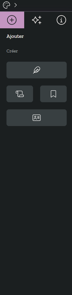
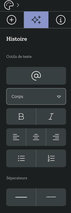
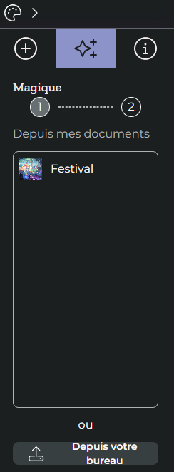
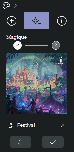
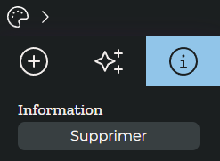
During the beta release, the palette presented itself as different tabs so that it could welcome various types of edition : creating modules, word and image processing as well as deleting pages.
Whereas this allowed to contain and categorise multiple options, this also compelled the users in navigating from one tab to the other quite frequently. This is why we carried out a reorganisation of the different editing options so that they all became accessible in one click.In order to do so, we have taken out the text and image processing as well as the page deleting options to insert them directly on the dedicated zones - images and text blocks - as toolbars.
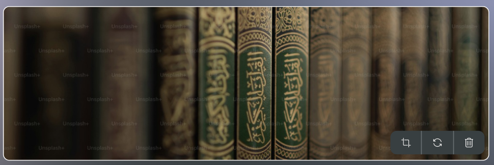
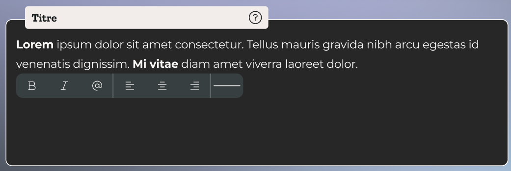
This not only lighten the palette, it also increased ergonomics.
Regarding the lack of precision on the buttons, we added explicit text next to the icons describing the button's action (e.g.: "New scene"). We took advantage of this change to reposition the buttons in a linear manner, in the form of a list. This makes them easier to read and therefore saves the user time when searching for information.
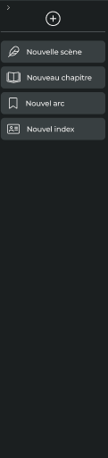
This gives us a more ergonomic and direct use of the palette for the user, creating added value in the use of software and limiting frustrations.
You can find all information about the Amsel Suite on their dedicated website..